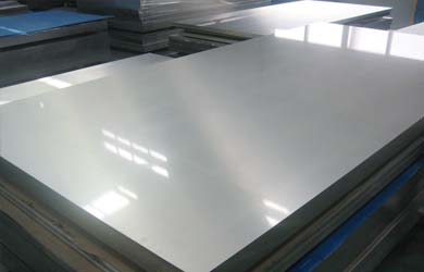
8 (831) 413-75-62 | Работаем по всей России

Responsive Layout

A responsive design automatically adapts itself to a particular viewing environment such as desktop, tablet or mobile, without the need for separate layouts for varying platforms

image

 Responsive Frameworks

We use the responsive layout based on Twitter's Bootstrap Framework, with its collection of utility classes, to provide a flexible responsive design.

Read Blog

 RocketTheme Extensions

The RokSprocket and RokGallery extensions are built to work with a responsive layout and support mobile touch events, such as 'swipe'.

Read Blog

 Media Queries in JavaScript

We have created a new helper class, RokMediaQueries.js, which provides a unified system that enables extensions to add media query listeners.

Read Blog

Responsive Layouts

image

Chapelco's responsive grid system is designed for desktop, tablet and smartphone systems, each with minor modifications to ensure compatibility in each mode. The table above shows the breakdown of screen resolutions and associated devices, and what layout characters are then applied to each.

Responsive Classes

image

Another useful feature available, via Bootstrap, is the collection of responsive utility classes that can be used to help tweak layouts by providing a simple method of showing or hiding modules. Insert the above module class suffixes into your settings to show/hide a module for a particular mode.

Media Queries

In terms of media queries, the breakdown is:

/* Smartphones */
@media (max-width: 480px) { ... }

/* Smartphones to Tablets */
@media (min-width: 481px) and (max-width: 767px) { ... }

/* Tablets */
@media (min-width: 768px) and (max-width: 959px) { ... }

/* Desktop */
@media (min-width: 960px) and (max-width: 1199px) { ... }

/* Large Display */
@media (min-width: 1200px) { ... }

Navigation

image

For mobile devices, there are two options, a dropdown panel menu with items in a tree format or a select box using the browsers own UI elements. Chose a format in the template's menu settings.

The Dropdown Menu is a CSS driven dropdown menu, offering such features as multiple columns, inline icons, subtext, modules and positions, custom column widths, item distribution and menu offsets.

SplitMenu displays 1st level items in the navigation bar and children in the Sidebar.

Материалы

Мы используем следующие материалы

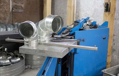
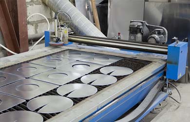
  • Вентиляция: оцинкованная сталь, нержавеющая сталь;
  • Дымоходы: оцинкованная сталь, нержавеющая сталь марки aisi 430, 409, 321, 304, 316, 310;
  • Утеплитель Rockwool используется для наполнения сэндвич изделий с рабочей температурой до 700 градусов
image image

Отводы

image image

Сборка сегментных отводов Beta 3

Станок для сборки отводов, изготовленный из высококачественных комплектующих, позволяет производить изделия толщиной 0,5-1,25мм из оцинкованной стали и 0,5-0,8 из нержавеющей стали, производительность 250шт. за смену.


Резка металла

Плазменная резка фирмы SPIRO

Производство Швейцария. Это экономичное оборудование, которое предназначено для выполнения работ с различными металлами толщиной до 8 мм. Этот станок представляет собой наиболее эффективное решение с наивысшей производительностью для любого цеха по изготовлению вентиляционных систем. Новейшая версия профессионального контроллера на базе ПК Spiro® HS имеет широкий выбор современных функций.

image image
 

Станки

image image

Станок фирмы SPIRO

Спирально-навивной станок, производство Швейцария. Производит круглые воздуховоды диаметром от 100мм до 1600мм, с толщиной металла 0,5-1,5мм оцинкованной стали и 0,5-0,8мм нержавеющей стали, длиной до 12м., обеспечивает ровный срез без заусенцев. Производительность такого станка доходит до 1600 воздуховодов за смену.