8 (831) 413-75-62 | Работаем по всей России

Responsive Layout

A responsive design automatically adapts itself to a particular viewing environment such as desktop, tablet or mobile, without the need for separate layouts for varying platforms

image

 Responsive Frameworks

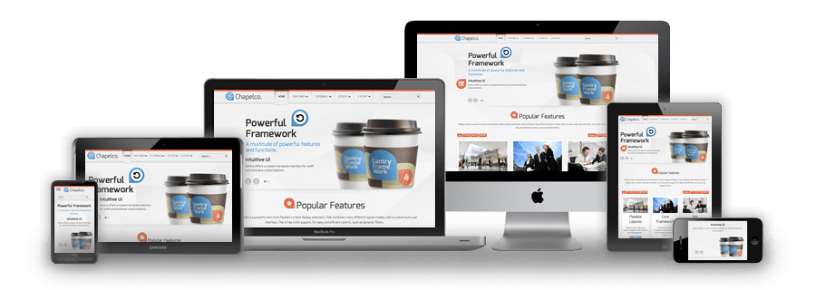
We use the responsive layout based on Twitter's Bootstrap Framework, with its collection of utility classes, to provide a flexible responsive design.

Read Blog

 RocketTheme Extensions

The RokSprocket and RokGallery extensions are built to work with a responsive layout and support mobile touch events, such as 'swipe'.

Read Blog

 Media Queries in JavaScript

We have created a new helper class, RokMediaQueries.js, which provides a unified system that enables extensions to add media query listeners.

Read Blog

Responsive Layouts

image

Chapelco's responsive grid system is designed for desktop, tablet and smartphone systems, each with minor modifications to ensure compatibility in each mode. The table above shows the breakdown of screen resolutions and associated devices, and what layout characters are then applied to each.

Responsive Classes

image

Another useful feature available, via Bootstrap, is the collection of responsive utility classes that can be used to help tweak layouts by providing a simple method of showing or hiding modules. Insert the above module class suffixes into your settings to show/hide a module for a particular mode.

Media Queries

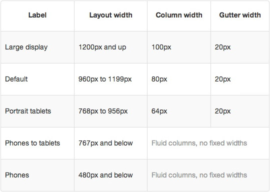
In terms of media queries, the breakdown is:

/* Smartphones */
@media (max-width: 480px) { ... }

/* Smartphones to Tablets */
@media (min-width: 481px) and (max-width: 767px) { ... }

/* Tablets */
@media (min-width: 768px) and (max-width: 959px) { ... }

/* Desktop */
@media (min-width: 960px) and (max-width: 1199px) { ... }

/* Large Display */
@media (min-width: 1200px) { ... }

Navigation

image

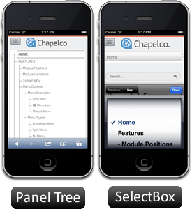
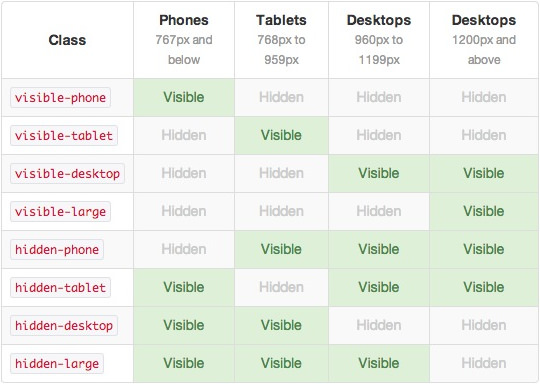
For mobile devices, there are two options, a dropdown panel menu with items in a tree format or a select box using the browsers own UI elements. Chose a format in the template's menu settings.

The Dropdown Menu is a CSS driven dropdown menu, offering such features as multiple columns, inline icons, subtext, modules and positions, custom column widths, item distribution and menu offsets.

SplitMenu displays 1st level items in the navigation bar and children in the Sidebar.

Заглушка ревизии


Назначение

Предназначена для чистки дымоходного канала.

Область применения

В модульных дымоходных системах.

Материал изготовления

Нержавеющая сталь марки aisi430, 304

Заглушка взрывного клапана


Назначение

Клапан взрывной необходим для предотвращения разрушения тепловой установки и деформации дымохода в случае взрыва горючих газов. Мы производим взрывные клапана диаметром от 100 до 300мм.

Область применения

В модульных дымоходных системах.

Материал изготовления

Нержавеющая сталь марки aisi430, 304

Притопочный лист


Назначение

Притопочный лист применяется как декоративный элемент, который, к тому же, повышает общий уровень пожаробезопасности.

Область применения

В банях или других помещениях, где расположены котлы или печки.

Материал изготовления

Нержавеющая сталь марки aisi430, 304


Экран


Назначение

Экран применяется как декоративный элемент, который, к тому же, повышает общую пожаробезопасность.

Область применения

В банях или других помещениях, где расположены котлы или печки.

Материал изготовления

Нержавеющая сталь марки aisi430, 304