Комплектующие для вентиляционных и инженерных систем
Каталог продукции
8 (831) 413-75-62 | Работаем по всей России
A responsive design automatically adapts itself to a particular viewing environment such as desktop, tablet or mobile, without the need for separate layouts for varying platforms
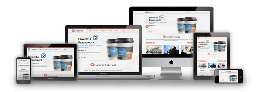
We use the responsive layout based on Twitter's Bootstrap Framework, with its collection of utility classes, to provide a flexible responsive design.
Read BlogThe RokSprocket and RokGallery extensions are built to work with a responsive layout and support mobile touch events, such as 'swipe'.
Read BlogWe have created a new helper class, RokMediaQueries.js, which provides a unified system that enables extensions to add media query listeners.
Read Blog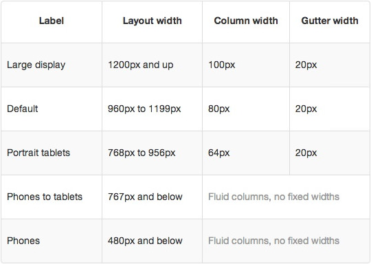
In terms of media queries, the breakdown is:
/* Smartphones */
@media (max-width: 480px) { ... }

/* Smartphones to Tablets */
@media (min-width: 481px) and (max-width: 767px) { ... }

/* Tablets */
@media (min-width: 768px) and (max-width: 959px) { ... }

/* Desktop */
@media (min-width: 960px) and (max-width: 1199px) { ... }

/* Large Display */
@media (min-width: 1200px) { ... }
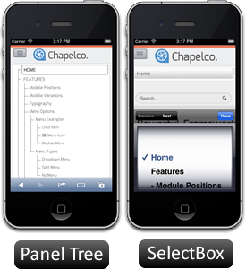
For mobile devices, there are two options, a dropdown panel menu with items in a tree format or a select box using the browsers own UI elements. Chose a format in the template's menu settings.
The Dropdown Menu is a CSS driven dropdown menu, offering such features as multiple columns and menu offsets.
SplitMenu displays 1st level items in the navigation bar and children in the Sidebar.
Каталог продукции
Joomla is an award-winning content management system (CMS), which enables you to build Web sites and powerful online applications. Many aspects, including its ease-of-use and extensibility, have made Joomla the most popular Web site software available. Best of all, Joomla is an open source solution that is freely available to everyone.
With millions of websites running on Joomla, the software is used by individuals, small & medium-sized businesses, and large organizations worldwide to easily create & build a variety of websites & web-enabled applications.
Joomla is used all over the world to power Web sites of all shapes and sizes. For example:
Your site actually has two separate sites. The site (also called the front end) is what visitors to your site will see. The administrator (also called the back end) is only used by people managing your site. You can access the administrator by clicking the "Site Administrator" link on the "This Site" menu or by adding /administrator to the end of you domain name.
Log in to the administrator using the username and password created during the installation of Joomla.
There is much more to learn about how to use Joomla! to create the web site you envision. You can learn much more at the Joomla! documentation site and on the Joomla! forums.
Visit Joomla!The Style Settings panel in the Gantry based theme administration interface provides several options for configuring the main built in stylistic aspects of the template.
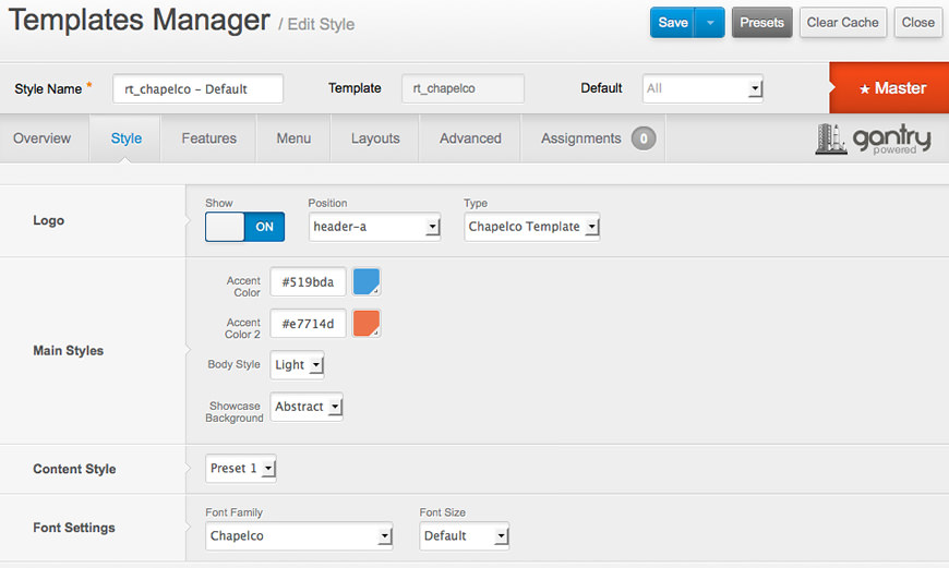
Gantry also provides the ability for you to create your own custom presets based on any parameter in the theme administrator. You should determine which parameters you wish to configure to be a part of the presets.
With Gantry, the ability to assign a certain style to an individual page has never been easier and/or more efficient. Just follow these simple steps:
After setting your defaults to the desired values, select the Menu Items button and choose the menu item you wish to modify the parameters for. You will then see a series of checkboxes on the left of all the supported parameters.
Select the checkbox next to the parameter you wish to modify, it will then become active, and you can modify as you wish. Clicking “Save” in the toolbar will then save this configuration.
Gantry Framework: Style Configuration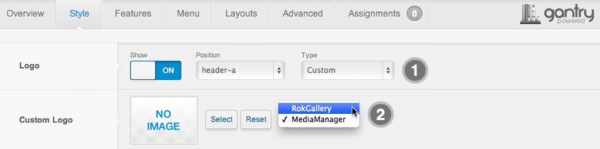
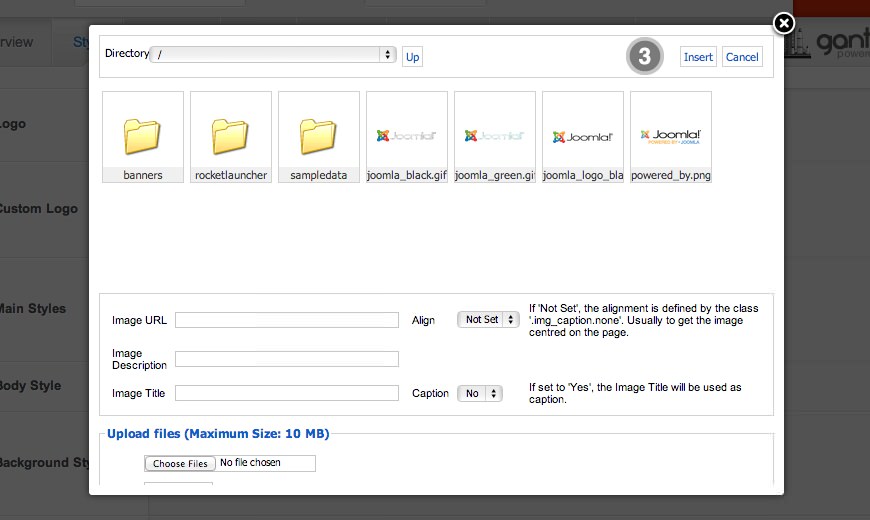
If you cannot see your new logo, ensure you have uploaded it to the right directory and the directory permissions are writeable. Enquire with your hosting provider.
Download Sources Here