8 (831) 413-75-62 | Работаем по всей России

Responsive Layout

A responsive design automatically adapts itself to a particular viewing environment such as desktop, tablet or mobile, without the need for separate layouts for varying platforms

image

 Responsive Frameworks

We use the responsive layout based on Twitter's Bootstrap Framework, with its collection of utility classes, to provide a flexible responsive design.

Read Blog

 RocketTheme Extensions

The RokSprocket and RokGallery extensions are built to work with a responsive layout and support mobile touch events, such as 'swipe'.

Read Blog

 Media Queries in JavaScript

We have created a new helper class, RokMediaQueries.js, which provides a unified system that enables extensions to add media query listeners.

Read Blog

Responsive Layouts

image

Chapelco's responsive grid system is designed for desktop, tablet and smartphone systems, each with minor modifications to ensure compatibility in each mode. The table above shows the breakdown of screen resolutions and associated devices, and what layout characters are then applied to each.

Responsive Classes

image

Another useful feature available, via Bootstrap, is the collection of responsive utility classes that can be used to help tweak layouts by providing a simple method of showing or hiding modules. Insert the above module class suffixes into your settings to show/hide a module for a particular mode.

Media Queries

In terms of media queries, the breakdown is:

/* Smartphones */
@media (max-width: 480px) { ... }

/* Smartphones to Tablets */
@media (min-width: 481px) and (max-width: 767px) { ... }

/* Tablets */
@media (min-width: 768px) and (max-width: 959px) { ... }

/* Desktop */
@media (min-width: 960px) and (max-width: 1199px) { ... }

/* Large Display */
@media (min-width: 1200px) { ... }

Navigation

image

For mobile devices, there are two options, a dropdown panel menu with items in a tree format or a select box using the browsers own UI elements. Chose a format in the template's menu settings.

The Dropdown Menu is a CSS driven dropdown menu, offering such features as multiple columns, inline icons, subtext, modules and positions, custom column widths, item distribution and menu offsets.

SplitMenu displays 1st level items in the navigation bar and children in the Sidebar.

Preset Styles

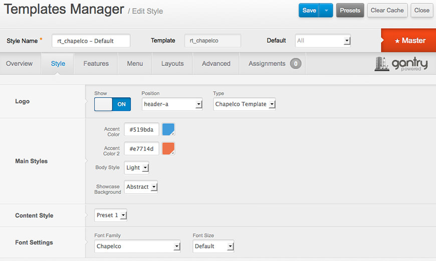
The Style Settings panel in the Gantry based theme administration interface provides several options for configuring the main built in stylistic aspects of the template.

Style

Gantry also provides the ability for you to create your own custom presets based on any parameter in the theme administrator. You should determine which parameters you wish to configure to be a part of the presets.


Assigning a Style

With Gantry, the ability to assign a certain style to an individual page has never been easier and/or more efficient. Just follow these simple steps:

  • Go to Extensions ? Template Manager ? rt_chapelco → Assignments → *Menu Item*
  • Select your preset from Show Presets, configure and save.

After setting your defaults to the desired values, select the Menu Items button and choose the menu item you wish to modify the parameters for. You will then see a series of checkboxes on the left of all the supported parameters.

Select the checkbox next to the parameter you wish to modify, it will then become active, and you can modify as you wish. Clicking “Save” in the toolbar will then save this configuration.

Gantry Framework: Style Configuration
Автор :