


Круглые воздуховоды
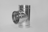
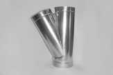
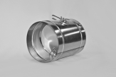
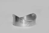 Врезка круглая (6) 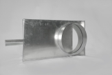 Шибер (6) |
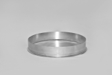 Заглушка круглая (6) |
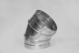
 Отвод 90 градусов (14) 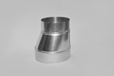 Переход (6) 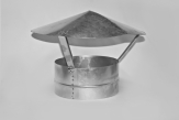 Зонт (6) |
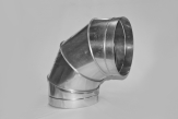
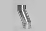
 Отвод 45 градусов (14) 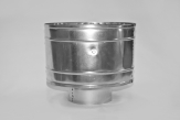 Дефлектор (6) |
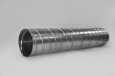
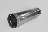
Воздуховоды круглые представляют собой вентиляционные трубчатые каналы круглого сечения, предназначенные для перемещения в нужном направлении воздуха или смеси газов.
Сегодня наибольшую популярность приобрели изделия данной группы, созданные из оцинкованной стали, и гибкие воздуховоды, имеющие различные конструкции. Воздуховоды круглые важны тем, что именно они позволяют свежему воздуху с улицы попадать в разные уголки помещения, а насыщенному испарениями и углекислым газом воздуху покидать обслуживаемое пространство.
Устройства применяются при механических и гравитационных системах вентиляции, используются в канальной системе кондиционирования и в системах воздушного отопления. В настоящее время воздуховоды круглые производятся как в виде прямолинейных участков воздуховодов, так и разнообразных фасонных деталей (отводов, тройников и др.), способных стыковаться между собой.
